Applying a rule from Pixar with a camera from 1961

While I love my digital camera, I felt the need for a camera that would challenge me and pull me out of my habits. A camera that I could bring anywhere, wouldn't use in the same situations as my digital camera, and would challenge me creatively.
What is this camera?

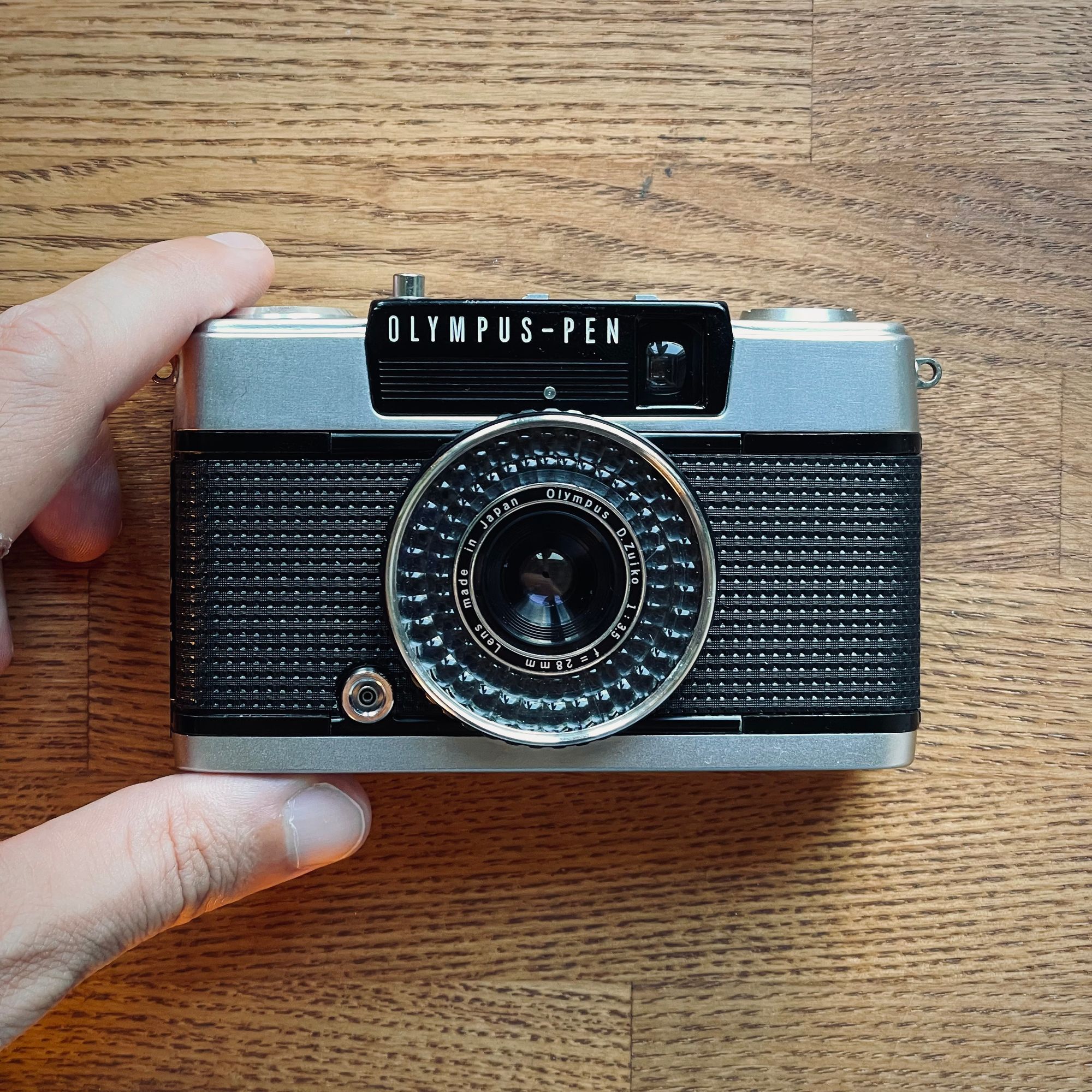
While visiting Tokyo's fabulous vintage camera stores, I discovered the Olympus Pen ee3.
This camera has an interesting origin story. Yoshihisa Maitani, the legendary Olympus camera designer, was on his way to work in Tokyo. He happened to see a mother photographing her young son with one of the cameras he designed. While watching her, he realised the pictures would be out of focus because of the settings. He then decided to design a camera that won't let you make a mistake. This camera is the Olympus Pen ee series.
The best part about it is that it's all automatic, no batteries are needed! (the exposure is measured through the selenium meter ring that you can see around the lens). Using something entirely mechanical feels magical. The ee3 is actually from 1973 but the design is nearly identical to the first model from 1961.
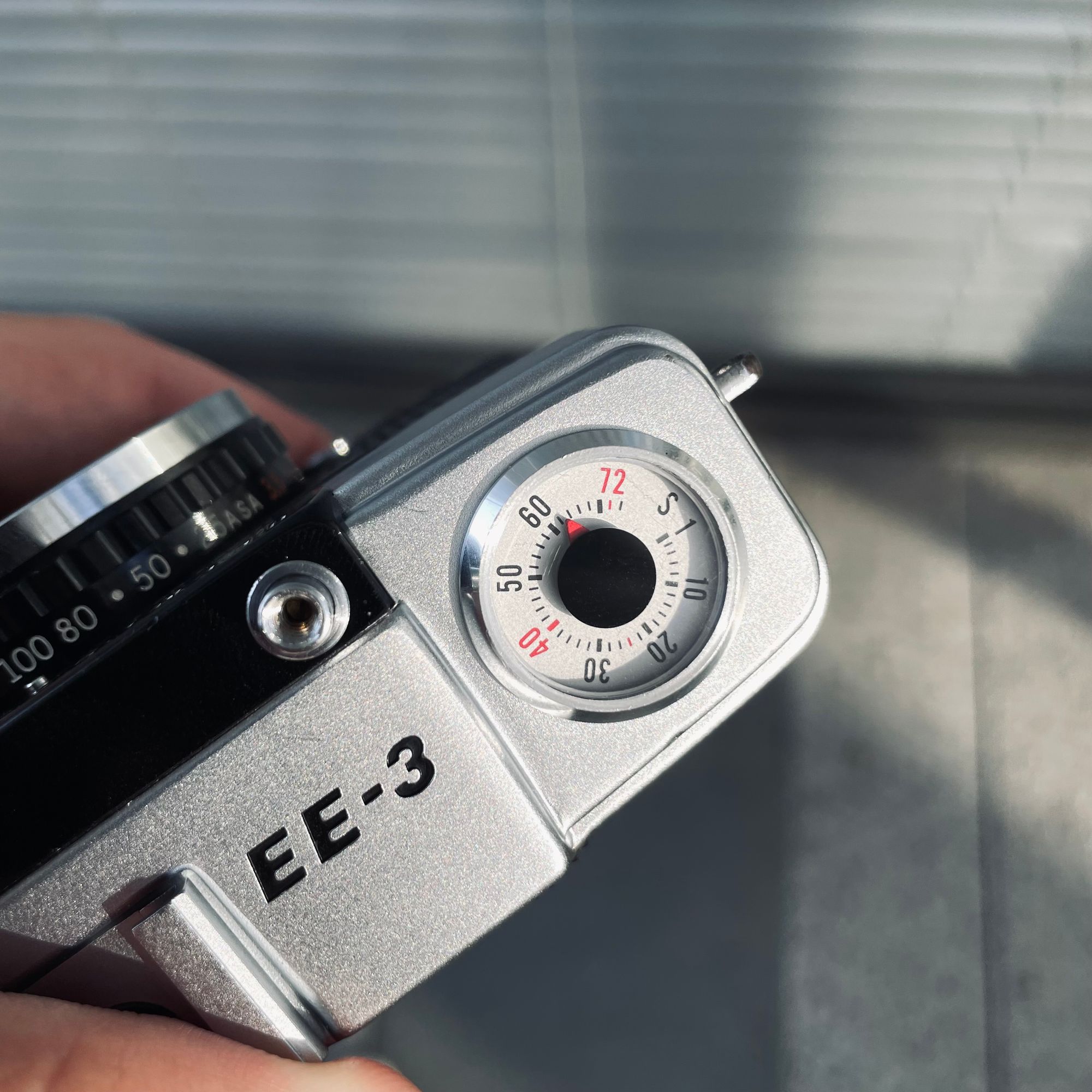
My favorite detail is probably the frame counter which reminds me of an old car's speedometer.

As you can see it goes up to 72, not the usual 36. The reason is that it is a half-frame camera. It splits a normal exposure into 2 vertical pictures, which allows you to do those double compositions called diptychs. And that's where Pixar comes in.
The Pixar rule
Don't give the audience 4, give them 2 + 2.
Giving out the pieces and letting your audience make the connection feels more gratifying. It demands participation from the viewer to make them work; the same way books, comics, and sketches do.
With that in mind, I went out walking in Tokyo to experiment with different strategies around that concept. Here are some photos taken with the Olympus Pen ee3.
Traveling through the picture
I remember as a kid looking at the images on the back of video game cases and wishing I could explore these worlds. I tried to bring that feeling into these diptychs. I wanted to give a sense that you could walk through the photograph.
![Tokyo station [Olympus pen ee3, Kodak Gold]](https://news.gregjeanneau.com/content/images/2022/07/IMG_5186.jpeg)
![Akihabara arcade center [Olympus pen ee3, Kodak Gold]](https://news.gregjeanneau.com/content/images/2022/07/IMG_5192-2-1.JPG)
![Parking in Tokyo [Olympus pen ee3, Kodak Gold]](https://news.gregjeanneau.com/content/images/2022/07/IMG_5173.JPG)
Paradoxical connections
I wanted these compositions to look arresting. The two images appear to be paradoxically connected across the division.
![Tokyo highways and shrine [Olympus pen ee3, Kodak Gold]](https://news.gregjeanneau.com/content/images/2022/08/half-frame-1.jpg)
![Akihabara streets [Olympus pen ee3, Kodak Gold]](https://news.gregjeanneau.com/content/images/2022/08/half-frame-2.jpg)
![Tokyo station [Olympus pen ee3 sample photo, Kodak Gold]](https://news.gregjeanneau.com/content/images/2022/07/IMG_5188-4.JPG)
Before/after
This concept is the closest to what you feel when reading comics. Yet I felt a bit underwhelmed and decided to focus on different experiments.
![Tokyo metro entrance [Olympus pen ee3 sample photo, Kodak Gold]](https://news.gregjeanneau.com/content/images/2022/07/half-frame-4.jpg)
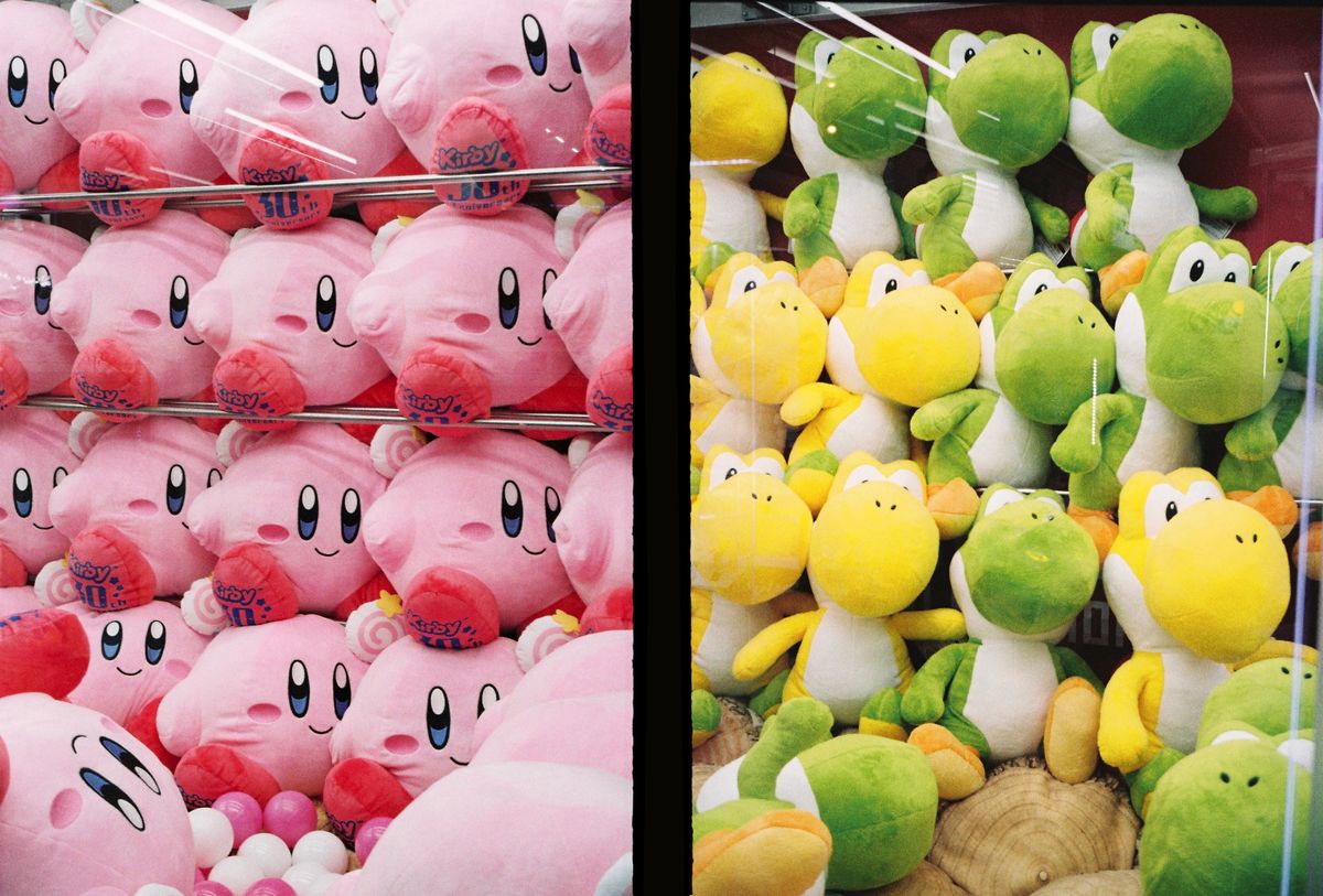
Consistency with Variety
Our minds love structure, yet too much of it causes boredom. We crave variety, yet too much of it can be overwhelming. However, when put together, variety brightens consistency.
For instance, toy makers are often using this principle. A common example is making the bodies/costumes consistent and using color as a variant (Power rangers, Ninja turtles, Lego bionicle, ...)
![Kirby and Yoshi plushes in a Akihabara claw crane [Olympus pen ee3 sample photo, Kodak Gold]](https://news.gregjeanneau.com/content/images/2022/07/half-frame-6.jpg)
![Multi level parking in Tokyo [Olympus pen ee3, Kodak Gold]](https://news.gregjeanneau.com/content/images/2022/07/IMG_5174.JPG)
![Automated elevator parking in Tokyo [Olympus pen ee3 sample photo, Kodak Gold]](https://news.gregjeanneau.com/content/images/2022/08/pen-07.jpg)
I had a great time with this little camera, it got itself a permanent spot in my backpack.
Experimenting to find new ways to connect the pictures and understanding the principles was a new kind of fun. I was not expecting to end up where I did.
It reframed how I shoot and nudged me into thinking in tiny projects and stories.
Take care!
Grégoire
Links:

